Chester Racecourse Crowd and Queue Simulation
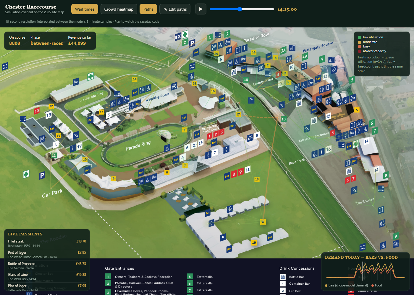
A raceday crowd, wait-time, and spending simulation for Chester Racecourse, played back over a full simulated raceday and rendered directly on top of the venue's own real site map rather than a from-scratch 3D reconstruction.
What it covers
An earlier attempt at a from-scratch 3D reconstruction of the venue kept fighting itself: buildings landing in the wrong place, aerial imagery that looked subtly stretched relative to the illustrated map. The approach that actually worked was simpler and more honest about what it was showing: take the racecourse's own published site map image and draw the simulation directly on top of it, so there is never any question of whether the venue "looks right" – it's the venue's own map. Every gate, bar, food stall, betting point, toilet block, and named enclosure from the map's legend was digitised to its actual pixel position on that image (around 40 individually placed landmarks, with a small set of minor markers falling back to a deterministic ring around their zone centre).
Underneath that map sits a coupled destination-choice and queueing model. Gates, toilets, and enclosures, nothing to meaningfully choose between, use a direct Erlang-C queueing baseline. Bars, food, and betting points instead run through a choice model that captures venues pulling demand from each other, so a queue building up at one bar visibly shows up as more demand at its neighbours. The underlying model samples every 5 minutes (the level the arrival-rate curves are actually meaningful at); the interactive slider then scrubs in 10-second steps, linearly interpolating node colour, heatmap intensity, path tint, and on-course headcount between the bracketing 5-minute samples, smoothing for display without inventing precision that isn't there.
One data model, two views
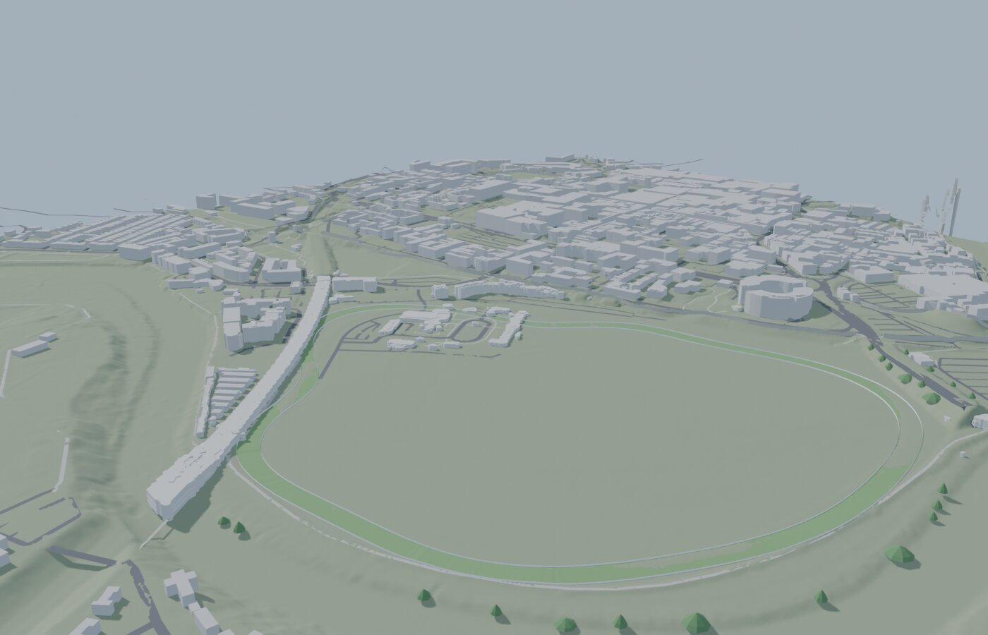
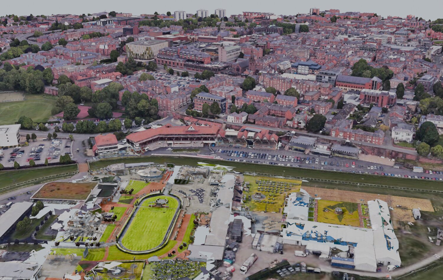
A single source-of-truth file lists every gate, bar, food stall, betting point, toilet block, and named enclosure straight off the map's legend; both the 2D map overlay and the standalone 3D model read from that same list, so the two views can't quietly drift apart from each other over time. The 3D model layers a further, independently sourced piece of ground truth on top: real, surveyed building footprints for 18 structures around the course, pulled from Ordnance Survey's open Data Hub Features API rather than crowd-sourced mapping data. Only two of those footprints could be confidently matched to a named building by proximity to known landmarks (the Weighing Room and the Owners & Trainers Pavilion); the rest render as an unlabelled but structurally real backdrop rather than guessed names. The large grandstands don't appear in that dataset at all, most likely because their open-sided roof canopies aren't captured as enclosed "buildings" in a topographic survey, so those stay as hand-built geometry, positioned by eye against the verified aerial photo instead.
The 3D model also has a live editing mode: click any marker and a drag gizmo lets you move, resize, or rotate it directly in the browser to nudge it closer to the real map, with edits autosaved to the browser and a one-click export back to plain JSON for baking a correction into the source data permanently, rather than every positioning fix needing a code change.
Phase two: an operational digital twin
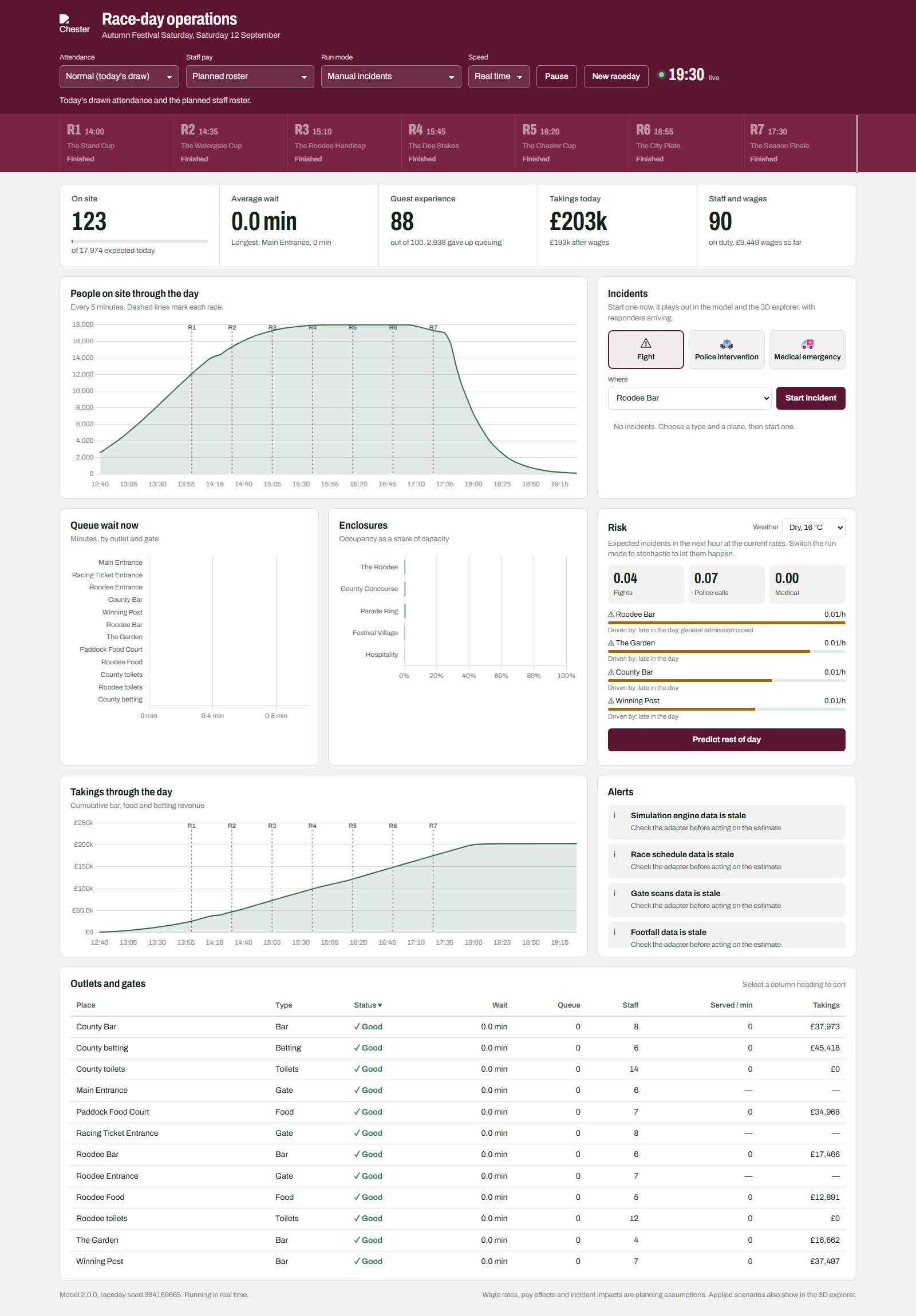
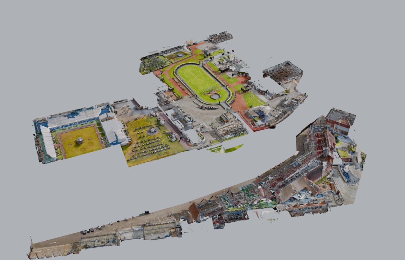
The map-overlay simulation above became the first stage of a fuller digital twin, built during my internship at the Virtual Engineering Centre (VEC), University of Liverpool. It has one simulation engine and three ways of looking at it: an operations dashboard, a 3D explorer of the real estate, and a viewer for the Matterport scans of the buildings. The engine runs as a separate model API, which publishes live state every second and accepts commands, scenario branches, replays, and observation data through a documented interface.
The engine and the dashboard
The engine simulates race-relative arrivals, traffic and parking, gate service, walking between areas, zone occupancy, destination choice, queues at bars, food outlets, betting points and toilets, customers abandoning long queues, payments, staff and wages, and departures. The dashboard controls it. Attendance can follow the day's random draw (17,000 to 19,000) or be set to quiet, typical, or busy. Staff pay can be set to the planned roster, a flat minimum wage, race-peak premium shifts, or the Real Living Wage, which changes who turns up, how fast they serve, and the wage bill. Headline figures include people on site against the expected total, average and longest queue, a guest-experience score out of 100, takings before and after wages, and staff on duty.
Incidents can be inserted by hand (a fight, a police intervention, or a medical emergency at a chosen location), and they play out in both the dashboard and the 3D explorer, with responders arriving. In stochastic mode, incidents also arise on their own at rates driven by time of day, crowding, bars, and weather, and each carries a "Predicted" tag stating what drove it. The risk panel shows expected incidents in the next hour and the riskiest places, and "Predict rest of day" runs 16 simulated copies of the remaining day to give an expected count and likely range for each incident type.
A georeferenced model of the estate
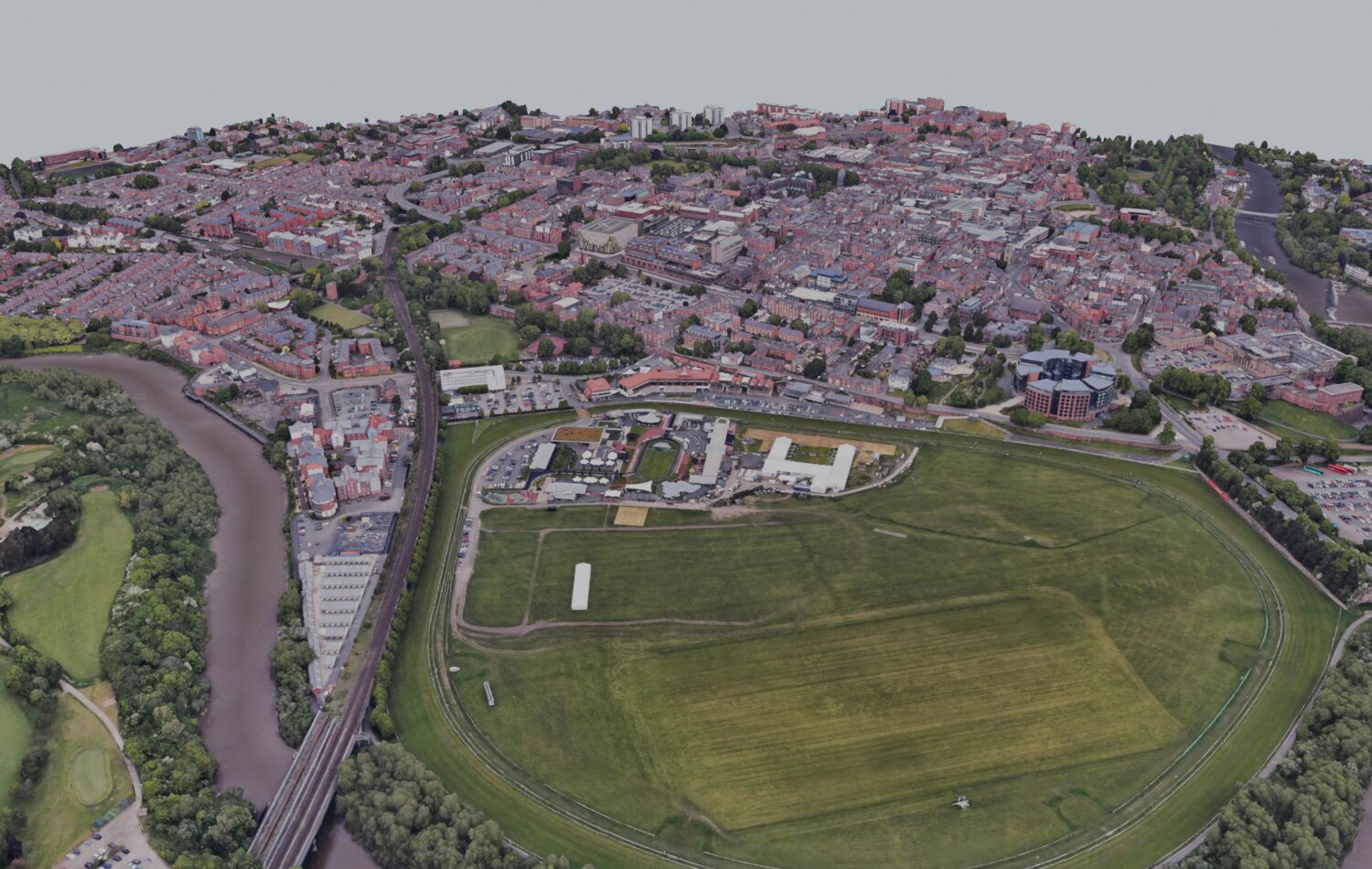
The reconstruction is anchored to British National Grid (EPSG:27700) with the OSTN15 horizontal and OSGM15 vertical transformations. During the build, the coordinate library silently chose a lower-accuracy Helmert transformation, which differed from OSTN15 by about 1.7 metres in northing at the site, so the pipeline now refuses to run without the proper grid. An audit of open data confirmed that OpenStreetMap has no racetrack geometry for Chester and that none of the 18 buildings inside the course boundary is identified as a grandstand. Building heights derived from elevation data were checked against published heights for 2,041 buildings, with an RMSE of 1.51 metres, inside the 2.5-metre threshold for a level-of-detail 1 model.
What is still assumed
The engine's inputs are seeded assumptions until real data are connected. The roadmap covers calibrating incident rates against Chester's incident and first-aid logs, connecting gate scans, EPOS takings, car-park counts, and weather through the existing ingest API, validating crowd densities against CCTV or footfall counts, and, over a longer horizon, multi-day fixtures, evacuation and crowd-safety scenarios, and step-free routing.
Headline results
- A full 7-hour raceday plays back in roughly 2.5 minutes, with paths between locations coloured and thickened live by the average wait/crowd level of the two nodes they connect, on a green–amber–red scale.
- A live crowd heatmap, driven by the same choice-model occupancy and computed via Little's Law, renders as additive radial-gradient blobs sized and coloured by headcount rather than static dots.
- A "bars vs. food" demand sparkline, summed across every bar and food node for the whole day, shows a clear six-peak cyclical pattern tracking the race schedule in both series.
- A live payments panel replays the simulation's actual itemised transaction log (7,000+ entries: item, venue, price) as time advances, with each purchase triggering a brief highlight on its venue's marker.
- An operations dashboard over a separate model API, with combinable attendance and staff-pay scenarios, manual and stochastic incidents, and a 16-run prediction of the rest of the day.
- A reconstruction on British National Grid with validated building heights (RMSE 1.51 m over 2,041 buildings) and Matterport scans registered into the aerial model.
- A companion 3D model (hand-built geometry plus verified Ordnance Survey building footprints, cross-checked pixel-for-pixel against the aerial imagery before trusting it) provides an alternative, more explorable view of the same venue and node data.
Discussion